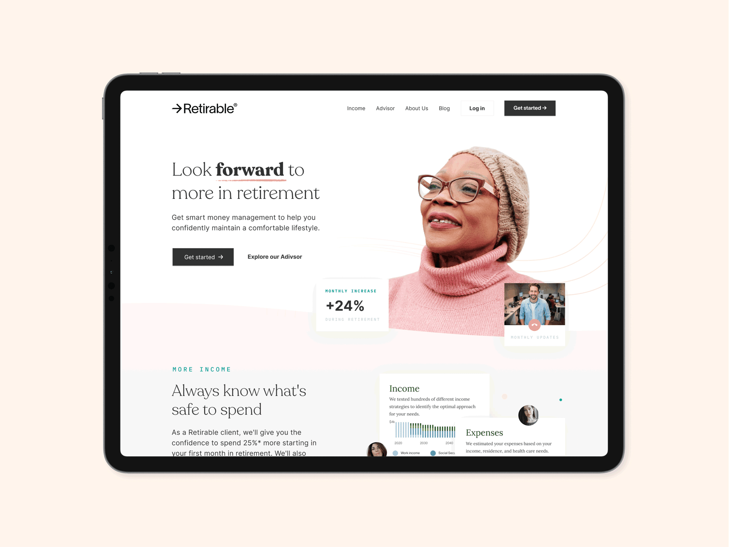
Retirable · Look forward to more in retirement
Retirement planning, built for the 50M people approaching it.
Retirable is a financial planning service for pre-retirees: the roughly 50 million Americans between 50 and 60 who are about to retire, most of whom have never seen a real plan. The product pairs every member with a Certified Financial Planner who actually builds them one. I worked on UX/UI for both the responsive web app and the marketing site.
Client
Retirable
Role
Product Designer
Team
Product Designer, Founders, Engineering, in-house CFPs
Timeline
2020
Shipped
Brand, design system, marketing site, responsive web app, onboarding chat, retirement timeline, spending card concept
The Brief
50 million Americans approaching retirement, almost none of them with a plan.
The problem
The solution
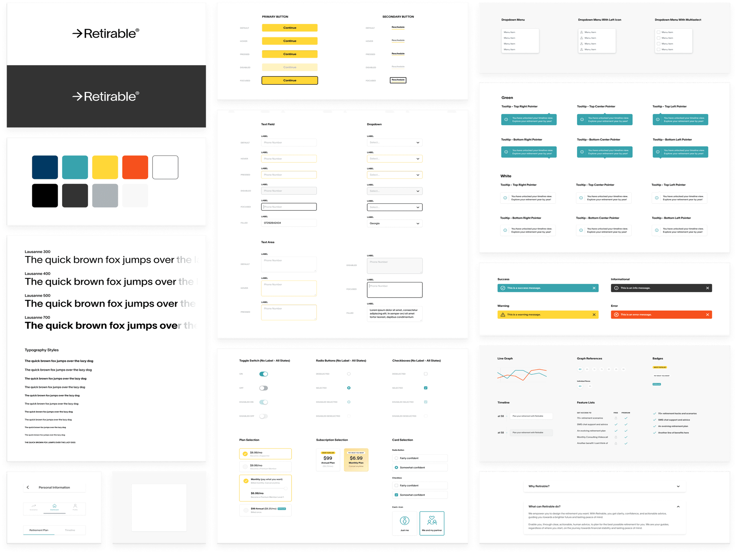
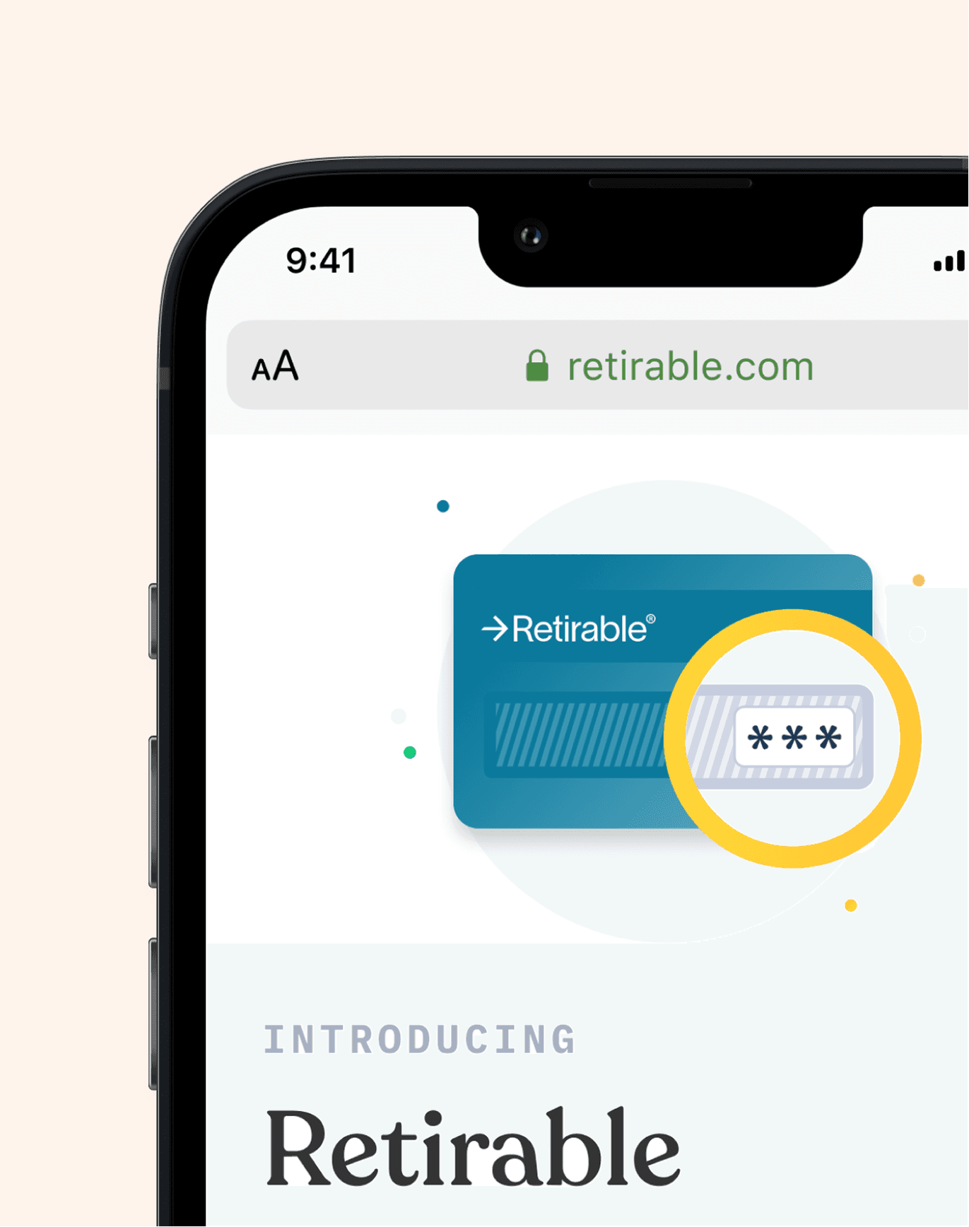
Brand
Approachable, but not naive.
Retirable was talking to people who'd been around money long enough to know when they were being sold to. The brand needed to feel warm and human without going light on credibility.
We landed on a palette and type system that read more like a thoughtful magazine than a fintech app. Built so the team could keep running it after the engagement ended.
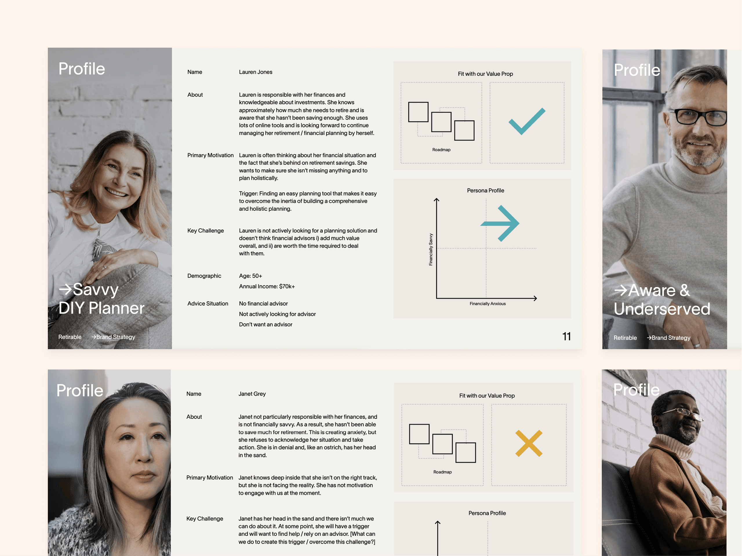
Two personas anchored most decisions: a confident DIY-er who wanted a sanity check, and a worried saver who'd never seen a plan.
Positioning
A CFP-led product for pre-retirees, not a robo-advisor.
In the pre-AI fintech of 2020, the obvious comparison was a robo-advisor: an algorithm that managed your money for you at a fraction of a human's fee. They tested badly with this audience. Pre-retirees wanted a human in the loop. Someone who'd look at their situation and tell them what to do.
So we built the product around the CFP. The app's job was to collect the context, hand it off, and then make the resulting plan readable.
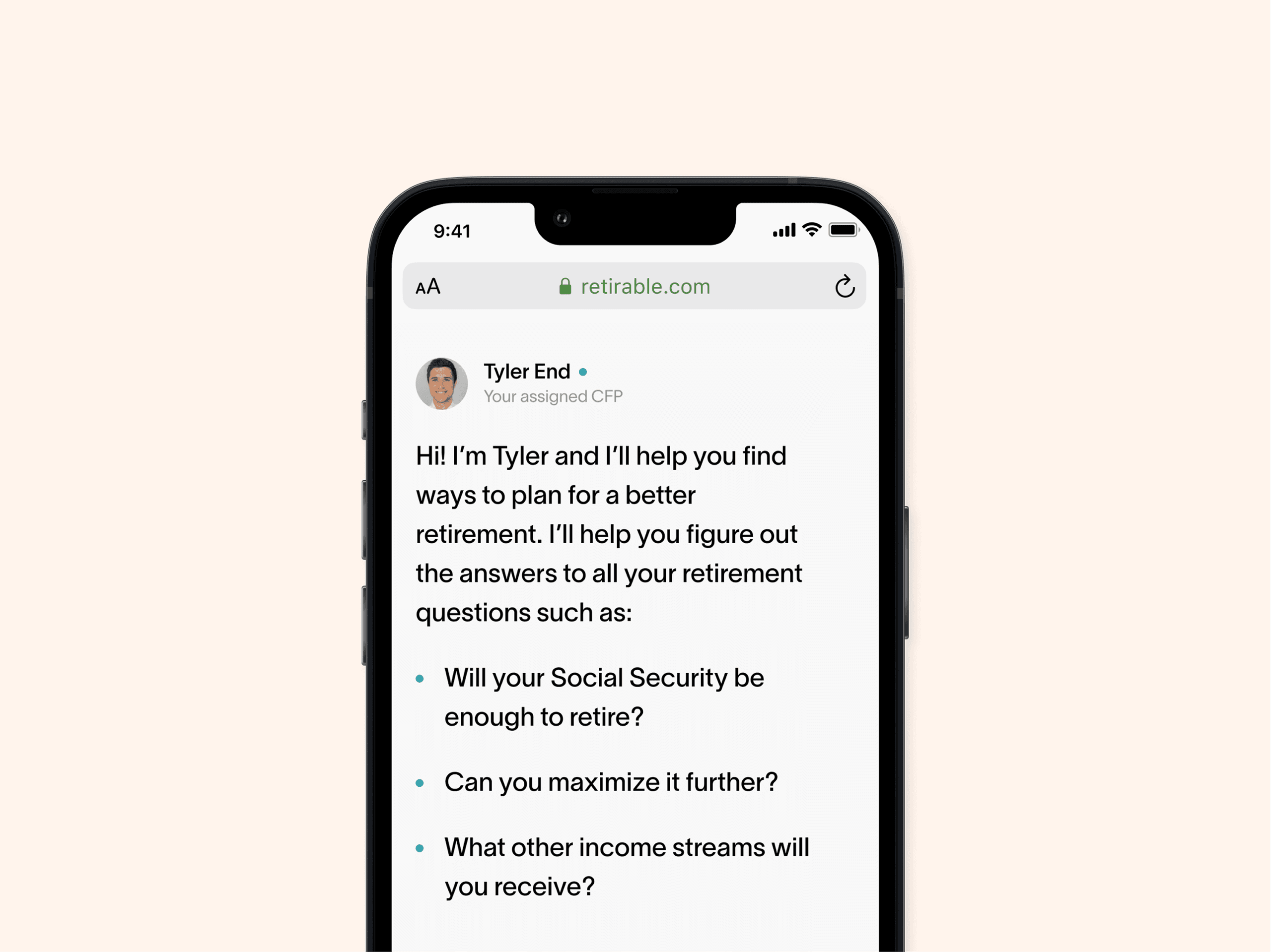
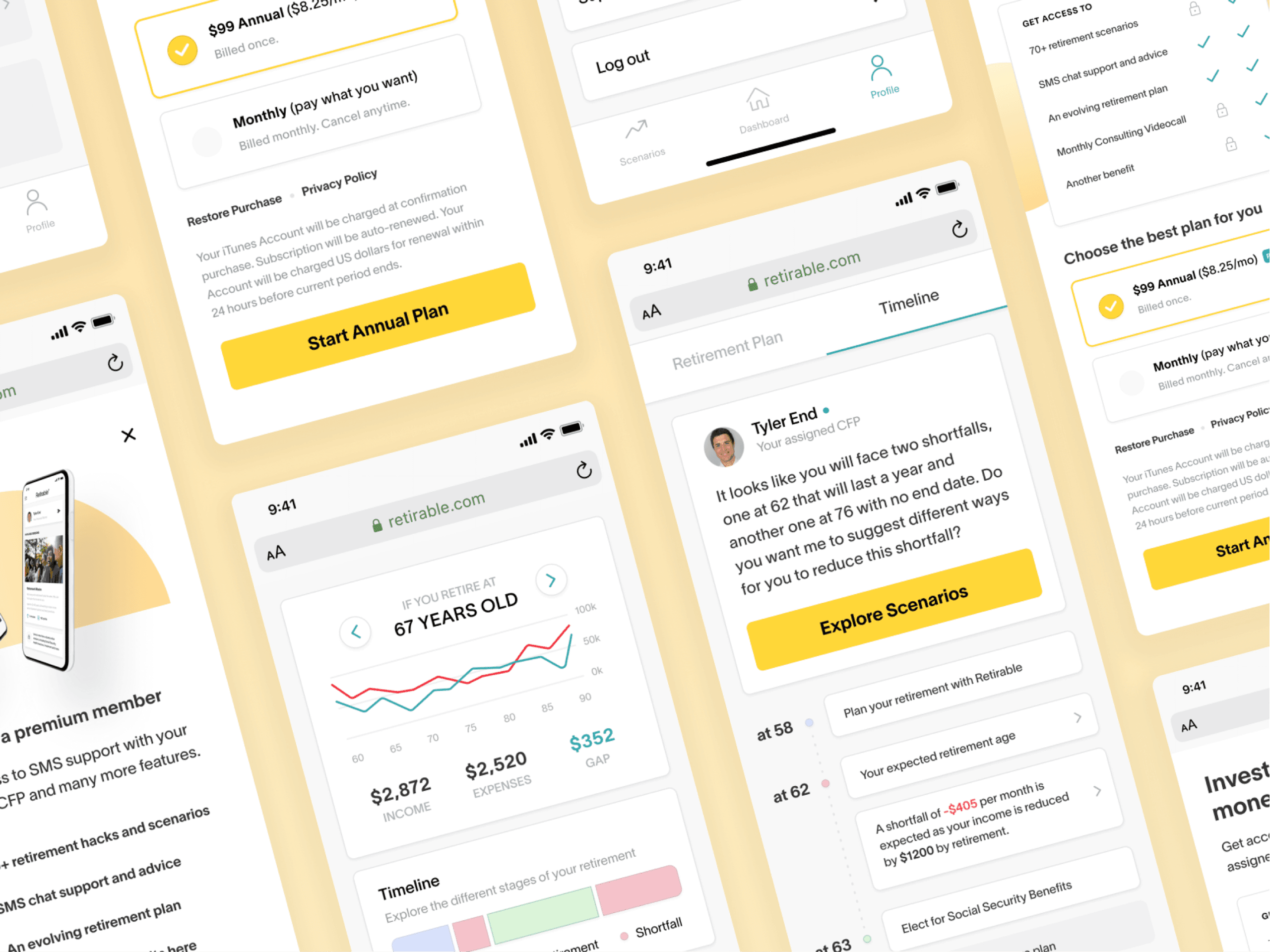
Onboarding was a guided chat with the assigned CFP. The CFP got what they needed; the member felt like they'd talked to a human.
Visibility
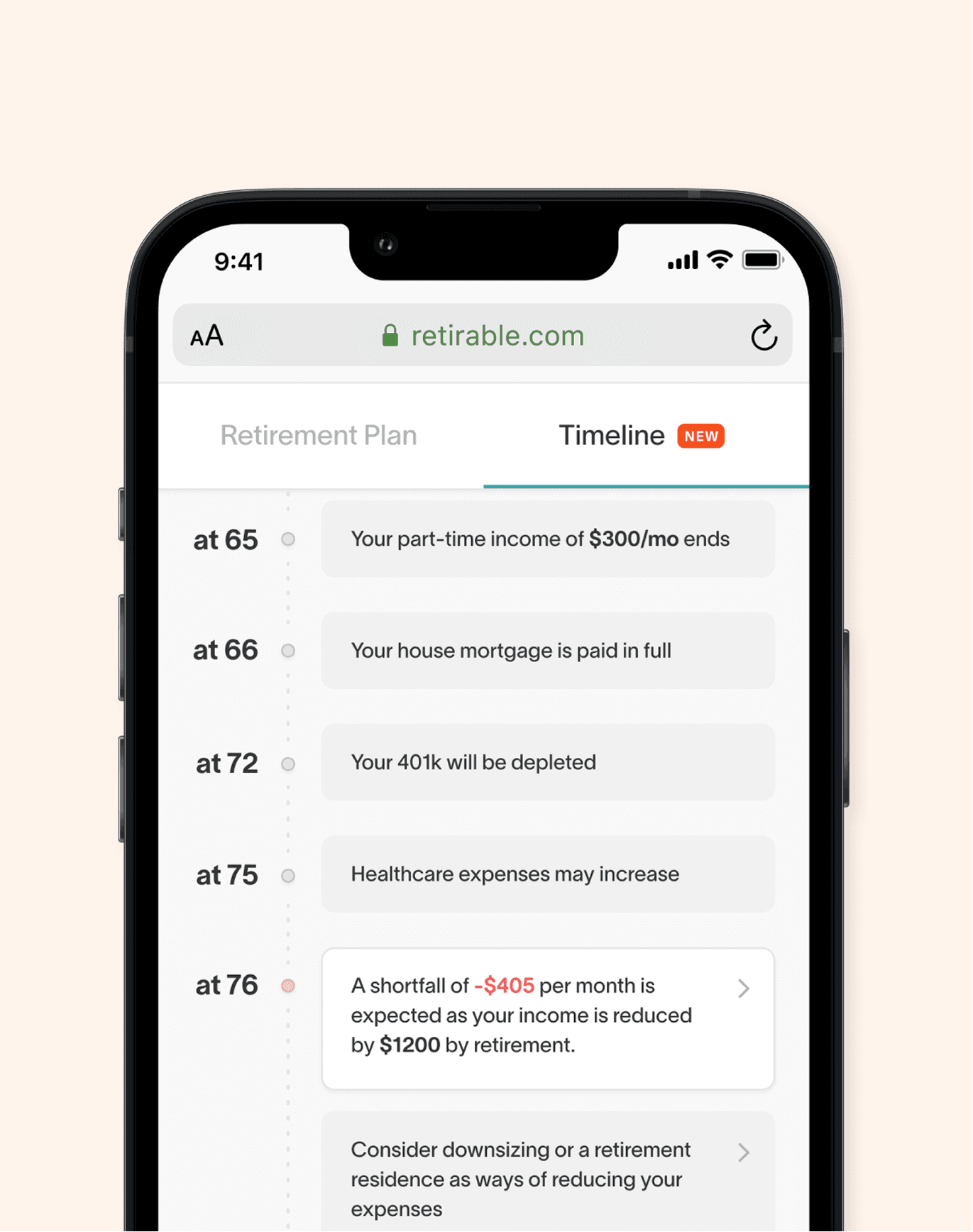
A retirement timeline, in plain English.
Once the CFP had context, the member got a personalized timeline of income, expenses, and when each one kicks in. The reaction we kept hearing in user testing: “oh, that's all this is?” Which was the point.
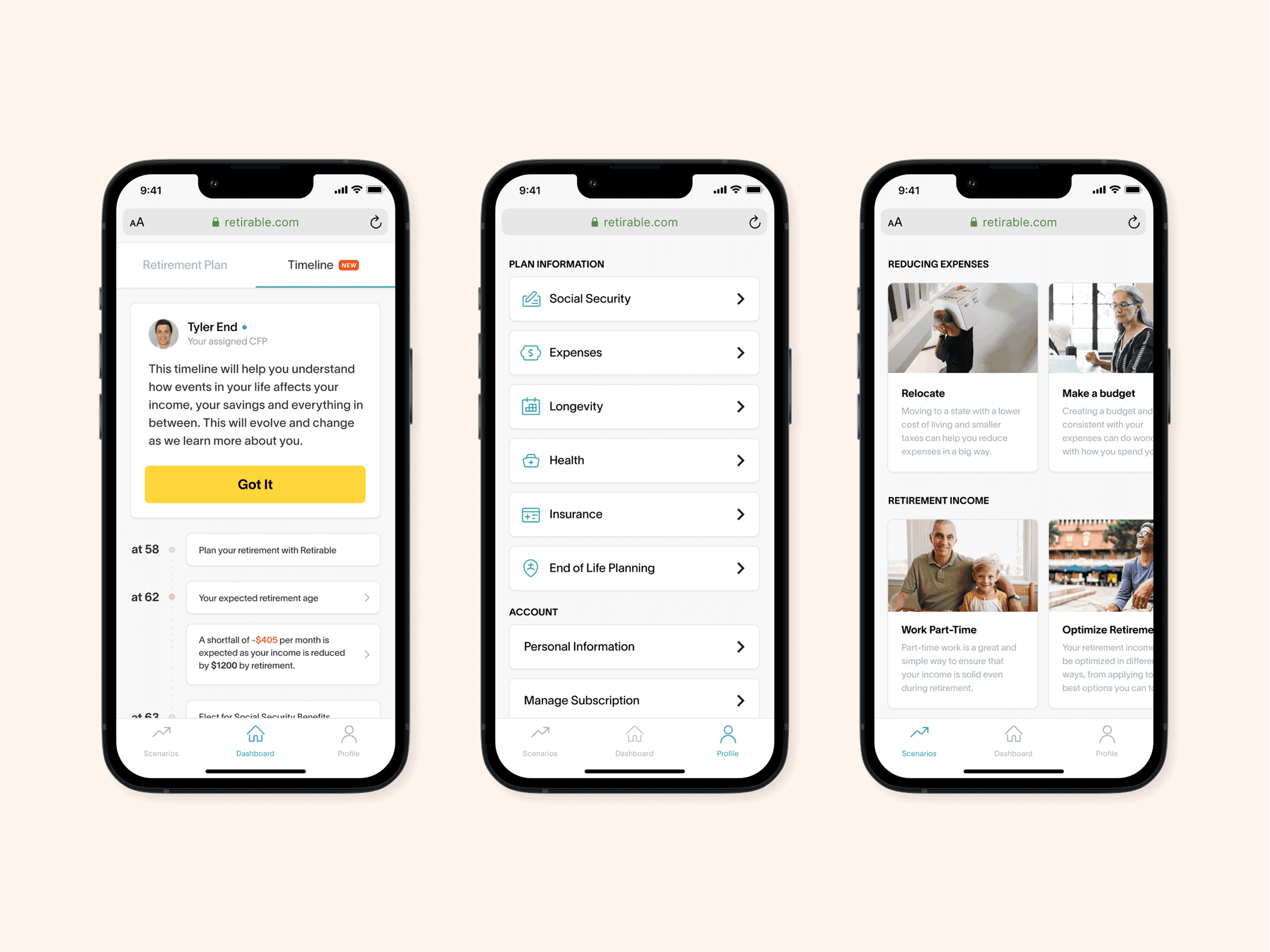
Plan timeline, plan details, projected retirement income. The same plan from three angles.
Data-informed
Spending data the plan could learn from.
The most common question we heard was “how much can I spend this month and still be on track?” The Retirable Spending Card was a step toward answering it: a card that fed real spending into the plan, so the CFP's recommendations could stay current with what was actually happening month to month, instead of frozen at signup.
Impact
Financial plans created during beta.
Pre-retirees joined during beta.
What I took from it
Three things I'd carry into the next one.
Selling to people who'd heard every pitch.
This audience had been sold to their whole life. They could smell a sales pitch from across the room. Most of the brand work went into looking like a company that didn't have one.
The CFP was the product. The app got people in the door.
Putting a real human in front of every member was the bet. The app made that relationship easy to start. The relationship itself was what people kept paying for.
Plain English is a design choice.
Most financial UI assumes you already know the vocabulary. We used the language a person would actually use to describe their own retirement. Once the words felt familiar, the rest of the UX got a lot simpler.
Testimonial
“Santiago is world-class! His work shines with its clarity, humanity, and its deep connection to the user. Every time I've worked with Santiago I've been blown away by his efficiency, intuition, and his ability to deliver strategic insights to product teams that have changed the trajectory of a business. You won't find a better designer, nor will you find a better human than San!”

Ian Yamey
Founder at Retirable